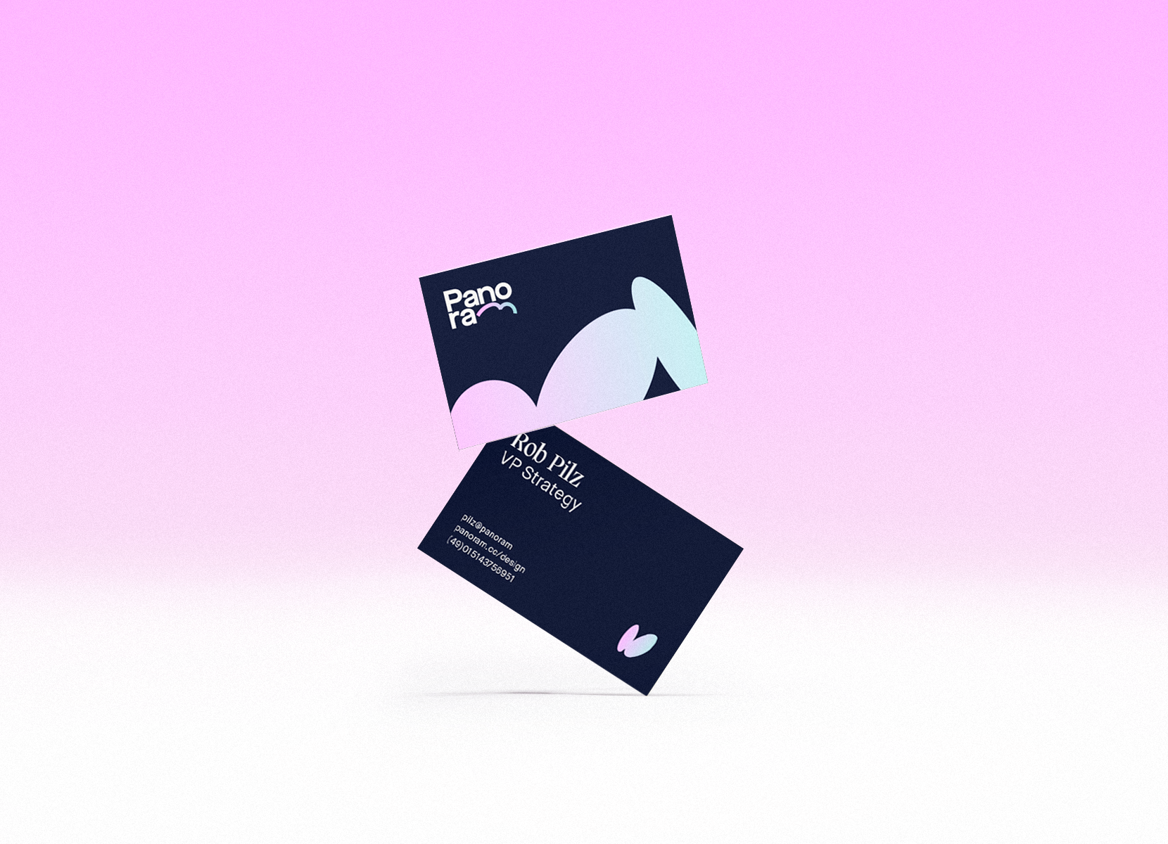
Panoram
Brand Strategy, Brand Design, Naming
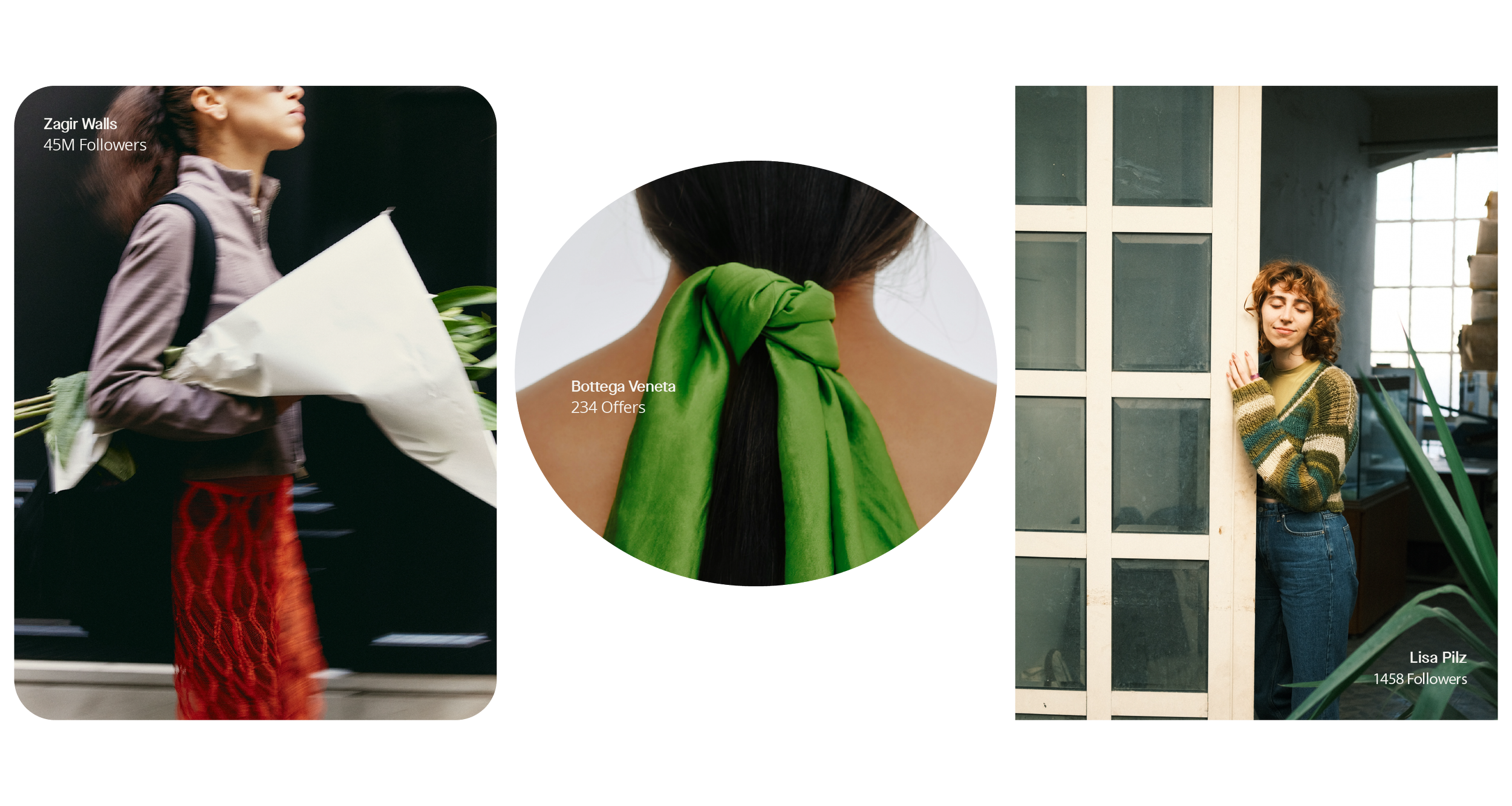
Panoram delves into the essence of togetherness. More than a shopping app is a nest to gather, meet and share a space with the like-minded. The inspirational seekers and the ones who inspire. And if it happens in a social place made especially for them, this inspiration comes with a feeling of ease, effortlessly ensuring everyone, whether user, influencer or brand.
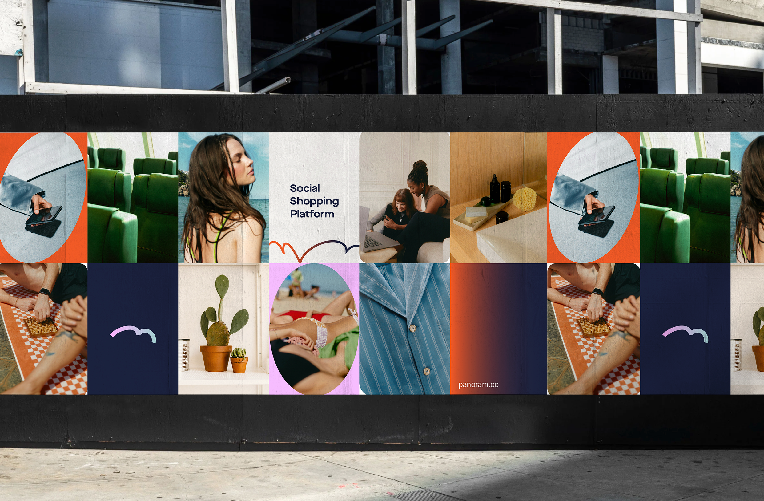
Built from the foundation of its brand strategy, the identity encompasses the expressive values of community, contemporary and character.
Build.
Express.
Inspire.
While it's great to show Panoram as the first true social shopping platform, the story has never been about them. They build trust by caring. They build recognition by curating. They inspire by giving others the stage.
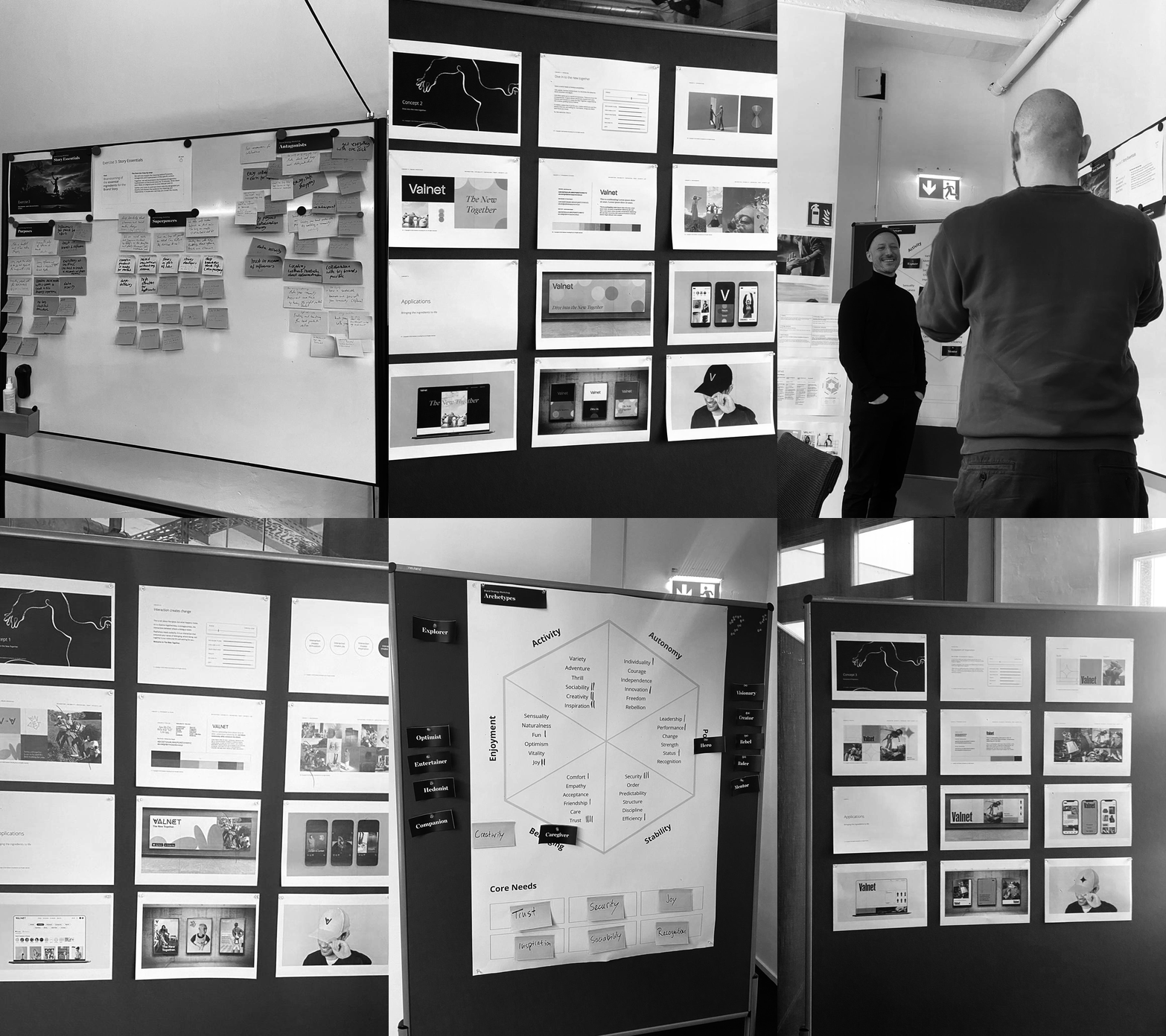
Strategy workshop, Internal & Competitor Analysis, Target Grouping, and other key processes to deliver the most cohesive and relevant brand design.
Logo.
Strapline.
Symbol.
Allows everyone in this space to grow, connect, thrive.Light and Dark version for the logo, the favicon and the symbol.
The bounce.
The friend.
The bounce is used as a shorthand identifier of the brand.
Migra from Pangram Pangram foundry and Maison Neue from Milieu Grotesque foundry as chosen typefaces.
Design Team – Andrew Weber, Natalia Demska, Mariana Arias.
Strategy Team – Vincent Kyas, Malte Adomeit, Valérie Ngom.
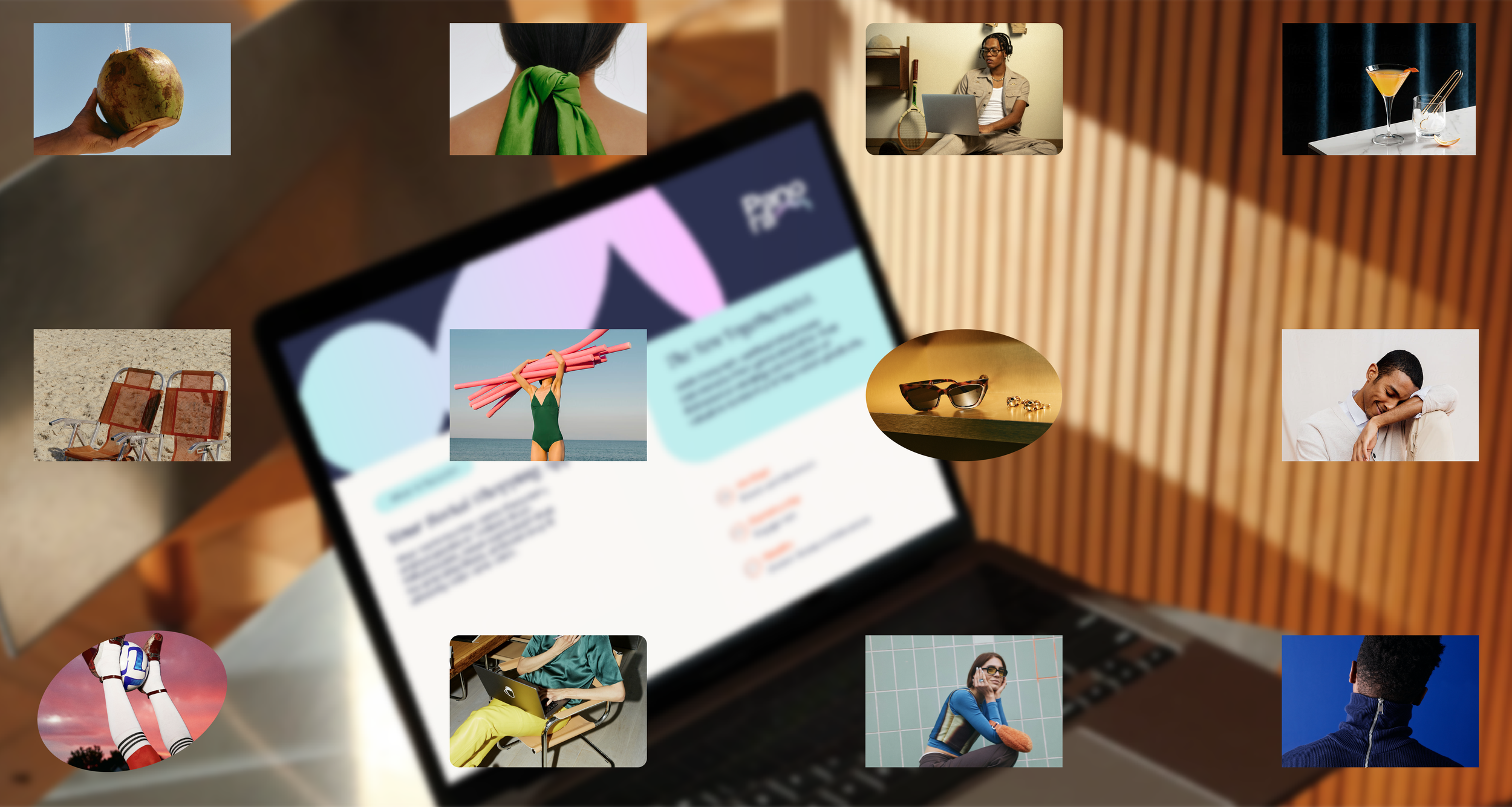
Photography in use from Death to Stock licence.
Panoram symbol is inspired in the sense of freedom and the safety of having a support system.
The summit.


