STERNAUTO
Brand Strategy, Brand Design
STERNAUTO is one of the largest multi-brand automotive dealerships based in Germany. Whether fully electric sedans, dynamic sports cars, powerful trucks or spacious recreational vehicles –– with this brand you will find the perfect model that meets your individual needs.
Steering a brand development ride from the strategic foundations to the brand design revamping. With STERNAUTO new stand-alone rebranding – released from a direct association to Mercedes-Benz, now B2B and B2C can experience the fascination and innovative power of renowned vehicle brands, which stand for quality and performance.
STERNAUTO brand identity is built on a comprehensive strategic process. Based on an in-depth analysis of customers and competitors, with six identified needs that are addressed and two brand archetypes to further sharpen the brand’s role.
Performance
Trust
Inspiration
Innovation
Individuality
Structure
Core needs.
Engine is on, let's go!Needsphere based on a neurobranding approach.
Hero
Delivering top performance to achieve ambitious goals.
It represents the commitment to excellence in every aspect and to supporting people with first-class performance to turn their wishes and ambitions into reality.
Guardian
Striving to care & protect people.
It symbolizes the empathy and attentiveness we show to people when we respond to them and their needs individually. This is how we create trust and long-term relationships.
Archetypes.
Research, sketch, ideate, test & repeat.This visual system is based on the core idea of empowerment through simplification. We guide people through the dynamic world of mobility.
Movement should always visualize our brand promise: a simplification of processes that leads to infinite possibilities.
The flagship of our brand.
It consists of both a symbol and a wordmark, which opens up many possibilities and allows flexible use at all touchpoints.
Horizontal Logo – Primary Use
Vertical Logo – Secondary Use
Symbol
From the core form, three basic shapes were derived that give us both flexibility and orientation and enable us to create a coherent, distinctive visuality in all our layouts: The Window, The Focus and The Loop.
The Window
The window opens the view to unlimited possibilities and opportunities.
The Focus
The focus symbolizes the experience people have with us as a process of simplification.
The Loop
The loop focuses on the one moment in which we use our expertise to find the one right solution.
Our pattern works to add extra dynamism. It sets our basic shapes in motion, which creates a ripple effect throughout our layouts.
The color system is based on a combination of calming tones with a bright, inviting and attention-grabbing orange. Complemented by a confident use of black and white as base colours to enable strong contrasts and recognition.
For infographics and supporting UI components, a secondary and tertiary palette is utilized in addition to the primary language.
A key identifying feature is the use of our iconic gradient. It immediately catches the eye and helps us stand out from the crowd.
For special use cases, we have developed secondary gradients that do not use Cinnabar.
We use the Atlas Grotesk type family in all our layouts, which is ideal for both digital and print. It is very clear, light and precise, but at the same time has special details that give personality and a high-quality effect.
We elaborated some bespoke icons.
We defined size, weight, and form principles for creating new icons that fit the overall image of our brand.
A comprehensive styleguide was developed for interactive use in Corebook.
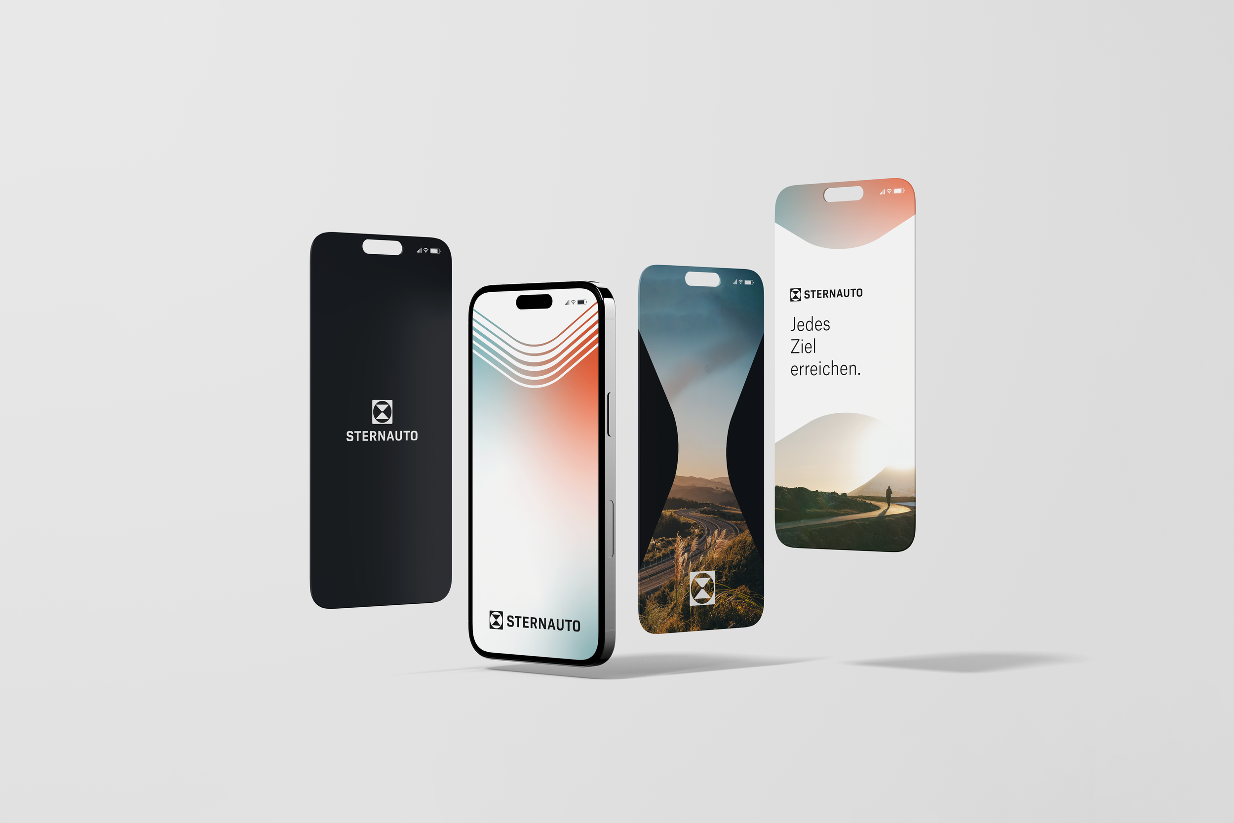
Jedes Ziel erreichen. STERNAUTO.
Brand Design – India Armstrong, Jonas Fries, Mariana Arias.
Brand Strategy – Dominik Minte, Emily Zima, Vincent Kyas.


